On Art: Season 3
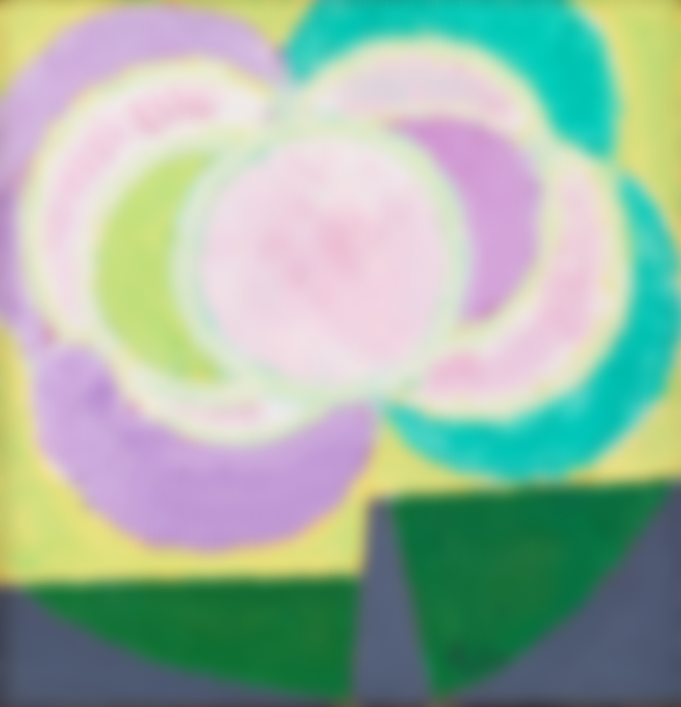
Frede Christoffersen (1919–1987)
Evening, Søborg
Oil on canvas
1958
Statens Museum for Kunst, Copenhagen
© Frede Christoffersen / VISDA
NOTE: The image above is intentionally blurred as it is rights-restricted. Please click on it to be taken to SMK OPEN.
S3E10. Tal R
I picked an artist called Frede Christoffersen. And I picked a painting called Aften Søborg, which means evening, and a place called Søborg, and it's painted in the end of the '50s. He simply painted the sun. And the thing is, the sun is quite rejecting. You can't really look into the sun. And if you do it — you can try — when you look away, you will very often see not one sun, but three or four suns because your eyes get burned. Plus you don't see the colors you imagine — very often in colors that are shades of weird green and blue and purple. And he spent a whole life doing this, staring into the sun, looking away, painting what he couldn't look at. When he didn't do this, or when his eyes were so burned, he would paint nights. He's really a wonderful painter. This whole idea of just spending your whole life doing one or two things like that, it's something I admire.
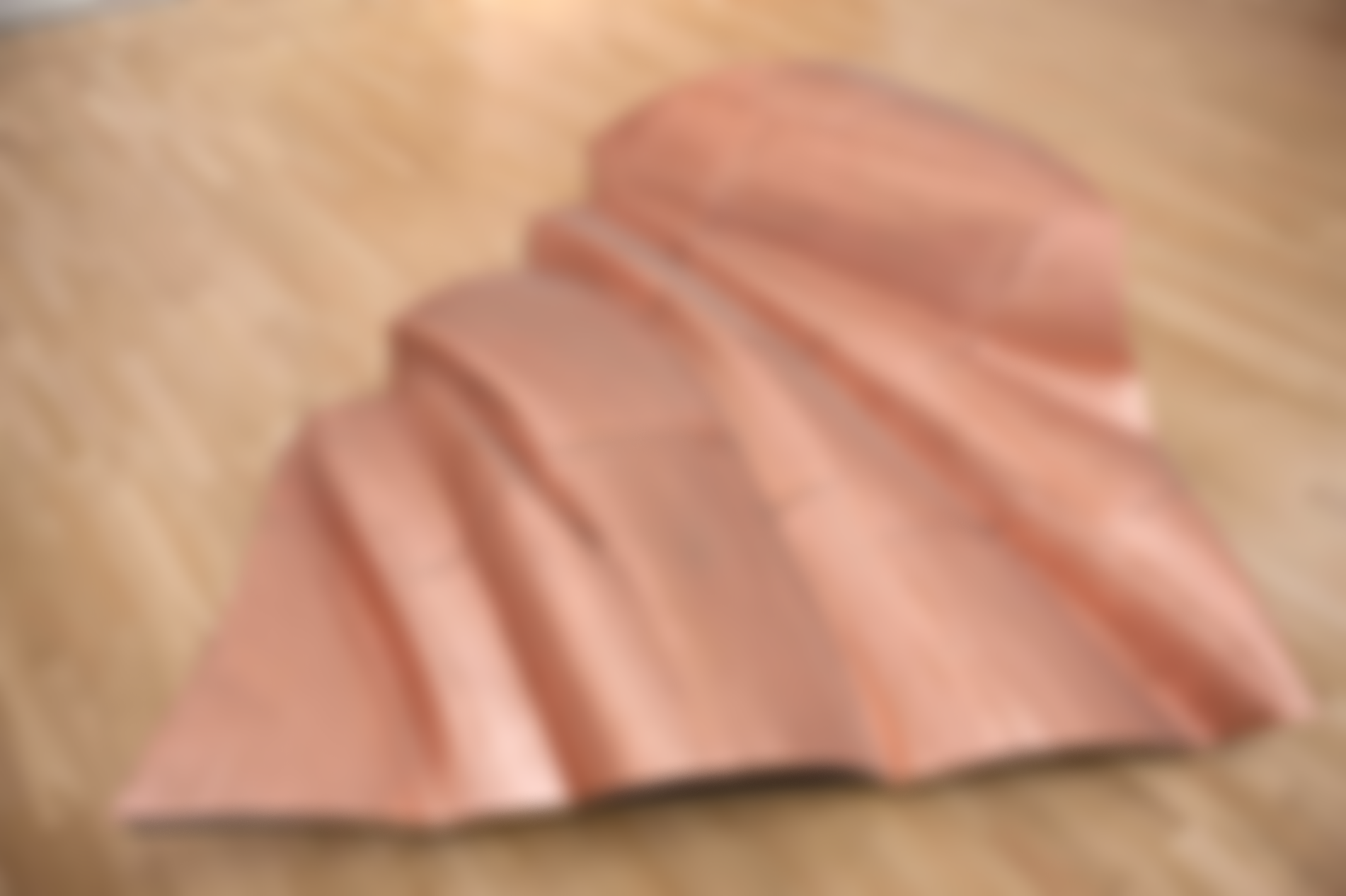
Danh Vo (1975–)
We The People (detail)
We The People (detail)
Copper
2011–2016
Statens Museum for Kunst, Copenhagen
© Danh Vo / VISDA
NOTE: The image above is intentionally blurred as it is rights-restricted. Please click on it to be taken to SMK OPEN.
S3E9. Jesper Bæhrenz
I chose We the People (detail) by a Danish Vietnamese artist called Danh Vō. It's two details, part of a toe, and part of a foot. It's a one-to-one replica of the Statue of Liberty, cut into 400 different pieces. It's done in copper, and he adopted "We the People," which is the first three words of the Declaration of Independence. The 398 other pieces are spread all over the world. And it's a rethinking of an old concept. With the iron core inside, and on the outside, it's clad with two millimeter-thin copper. He thought, that's how I can recreate it by taking the skin of the statue. It's art as concept. He saw something and he said, what is my new take of it? How am I going to make us think about the Statue of Liberty in a different way? As an immigrant to the US, there's hardly anything more American than the Statue of Liberty. Danh Vō was from Vietnam, came to Denmark, and he has this idea about taking things that we know and then recreating. I feel one of the fragments is almost me, going to the US and going back to Denmark. I'm a fragment of the US and a fragment of Denmark.
Lilibeth Cuenca Rasmussen (1970–)
Family Sha-la-la
Video
1998
Statens Museum for Kunst, Copenhagen
© Lilibeth Cuenca Rasmussen / VISDA
NOTE: The image above is intentionally blurred as it is rights-restricted. Please click on it to be taken to SMK OPEN.
S3E8. Anni Holm
I picked Lilibeth Cuenca Rasmussen's Family Sha-la-la because it spoke to me in regards to fitting into a community. It's a video of her family dancing to this Sha-la-la song. Some of her siblings really were onto it. Her mom and her dad, a little bit out of sync all the time. Lilibeth Cuenca Rasmussen, she’s half Filipino, half Danish. Having grown up in the Philippines, Denmark must have been such a culture shock. When I came to the US, I went out with some friends and we went to a place where they put on the Cha-Cha Slide. To the left, y'all, to the right, y'all, and two jumps this time. It was so hard for me to follow directions. But the more you practiced, I started to get it. And it was so much fun to try to fit into this very American community dance. My husband, his parents came from the Philippines to the US. My first encounter with Filipino culture was when I became part of his family. I was typically that one white person. I was also the tall person. I really stuck out in many ways. How do you become part of this so you don't feel like you're so different from everybody else?
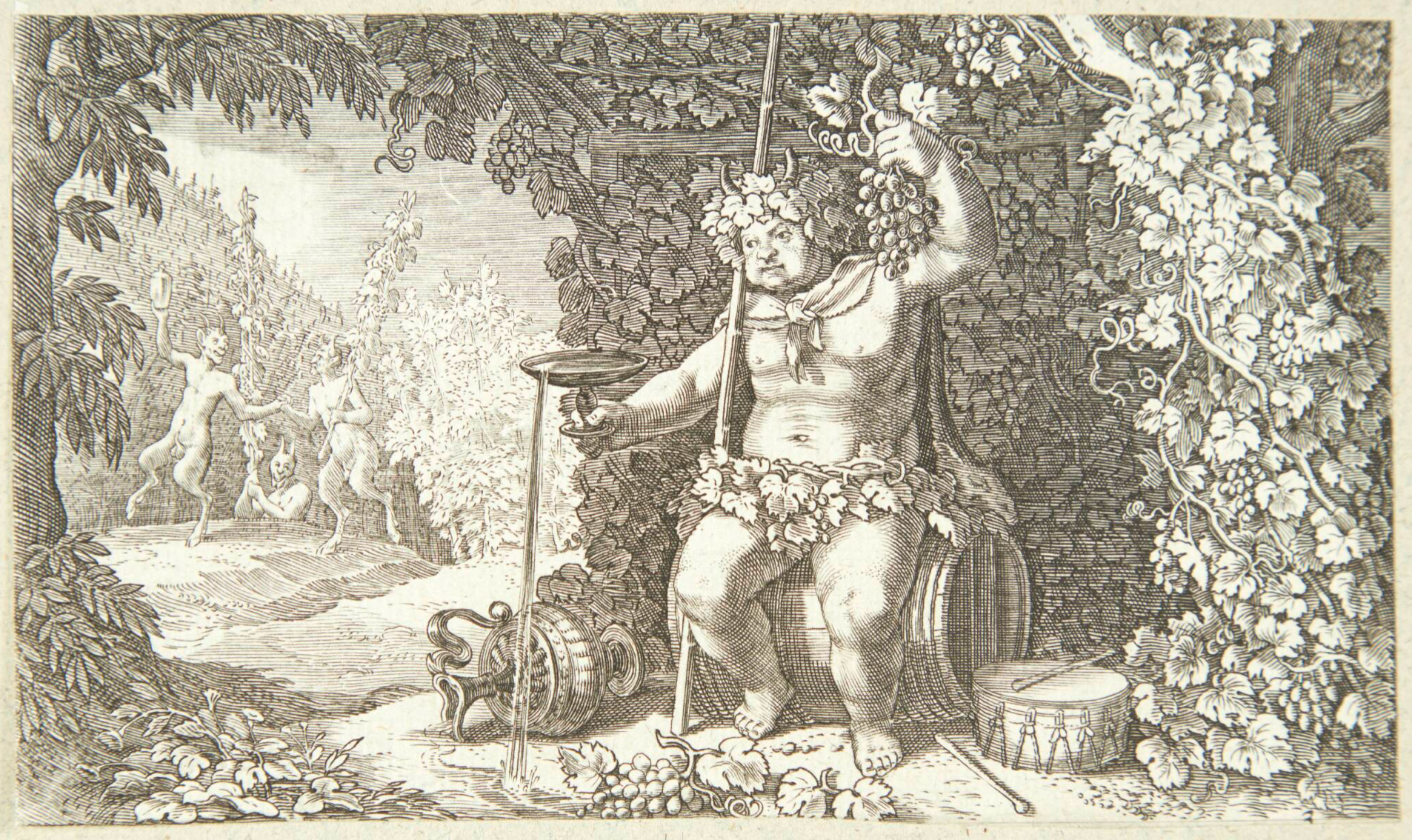
Jacob Matham (1571–1631)
Bacchus as the God of Wine
Copper engraving
1616
Statens Museum for Kunst, Copenhagen
S3E7. Peter Work
I picked Bacchus by Jakob Mattson because Bacchus is the god of wine and celebration. What I see in the picture is the harvesting, getting the grapes, squeezing the grapes, turning the grapes into wine. Of course it doesn't happen in a matter of seconds. It's a longer process, picking those clusters, squeezing the clusters, creating that wine, that one day will end up being part of Bacchus's party. And the picture, it's such a symbolic expression of what we think wine is about. Bacchus is what defines a lot of what we do. When we make our wine here and the wine is being used for celebration, that is what Bacchus stands for. Now Bacchus was also the name of our first dog, a Chocolate Lab, that we got just a few months after we bought the property. And Bacchus was the dog we had when we went through the transition moving up here. Bacchus went from city dog to farm dog, coming up here, running around. So Bacchus has always been an important part of our life up here.
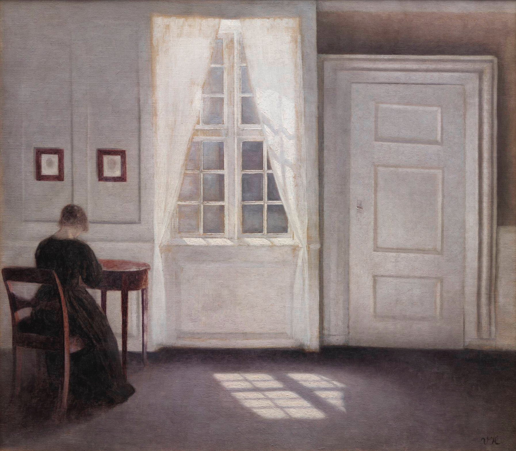
Vilhelm Hammershøi (1864–1916)
Interior in Strandgade, Sunlight on the Floor
Oil on canvas
1901
Statens Museum for Kunst, Copenhagen
S3E6. Anna Eckhoff
I chose a painting from Vilhelm Hammershøi, titled Interior in Strandgade, Sunlight on the Floor. It's divided into three pieces. To the left, you have his wife, Ida, seen from behind in this room in Strandgade. You have the window in the middle, and the sunlight is coming in, casting a shadow on the floor. And then to the right, you have a door. The painting is in black and white and brown colors, almost like photography. I like the left part of the painting where Ida is sitting because you can somehow hide there and you don't have to be exposed and I feel calm when I see her part. You can just hide over there in the dark side of the room. When I'm going out with my book and making all these book talks, I'm so exposed sometimes, and sometimes the audience likes me and sometimes they don't like me. I just feel exposed because I'm telling about my own life. And being able to hide in the corner of this room in the dark, it would be nice and not having to show my face.
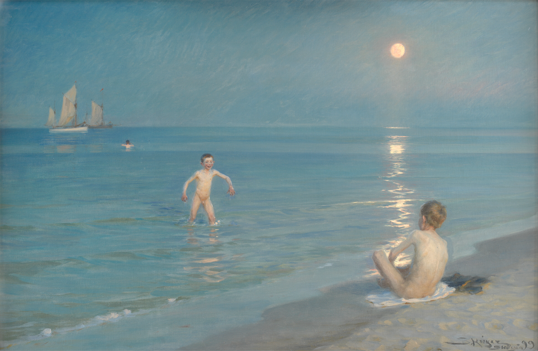
P.S. Krøyer (1851–1909)
Boys Bathing at Skagen. Summer Evening
Oil on canvas
1899
Statens Museum for Kunst, Copenhagen
S3E5. Caspar Phillipson
P.S. Krøyer's painting Boys Bathing at Skagen. Summer Evening. It's a painting of a completely still late evening. The sun doesn't properly set in Skagen when it's midsummer. Well, it's a couple of bathing boys with the moon shining into the water and this incredible blue. It's joyful, it's beautiful, it's hopeful, it's positive. I'm not saying that art only should be that. We live in times that are challenging. I mean, Krøyer struggled with depression himself throughout his life, but he insisted on depicting the beautiful side of life as well. I've been Krøyer in a big musical in Denmark, so I geeked Krøyer in a big way at the time. And the funny thing about playing a part, or at least it is for me, I feel some sort of ownership. So if people aren't properly positive about his artwork, I get slightly personally offended.
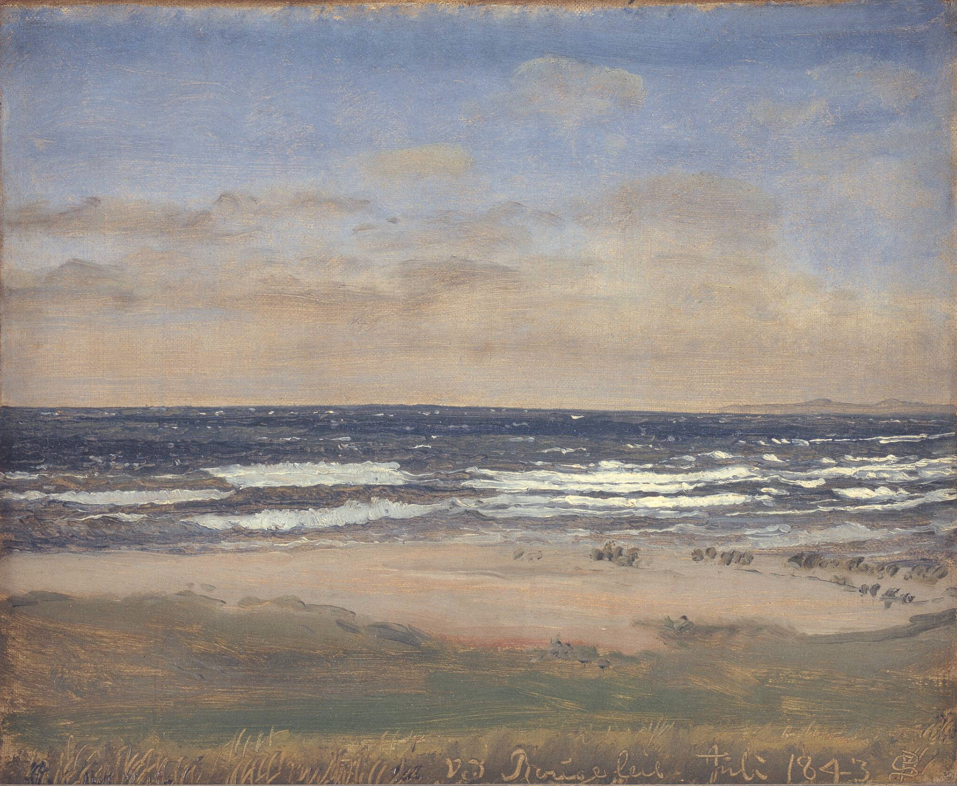
P.C. Skovgaard (1817–1875)
The Beach at Rågeleje
Oil on canvas
1843
Statens Museum for Kunst, Copenhagen
S3E4. Julie Reumert
I chose The Beach at Rågeleje by P.C. Skovgaard. Creative people get drawn to the ocean for some reason. And walking on the beach clears my head and it brings back memories of my childhood. And the Golden Age, I find to be very interesting. And this is from that era, that time in history, where Denmark was bankrupt. And there was all this pressure, that modern breakthrough that's about to happen. Like Hans Christian Andersen was writing stuff and Lumbye was writing music, and Niels W Gade was composing, Søren Kierkegaard would walk around the streets of Copenhagen. And Rågeleje, what was that like? Was that where artists would go to seek inspiration? And the colors, and the birds, and that particular smell that Danish beaches have. That feeling of a summer day that kind of never ends. When you're a child, the summers seem like they're never ending; as an adult, they're ending so fast.
Jesper Rasmussen (1959–)
Dumbo Brooklyn New York
Photograph
2005
Statens Museum for Kunst, Copenhagen
© Jesper Rasmussen / VISDA
NOTE: The image above is intentionally blurred as it is rights-restricted. Please click on it to be taken to SMK OPEN.
S3E3. Asger Hussain
I've chosen a photograph by Jesper Rasmussen, called Dumbo Brooklyn New York. Dumbo used to be an area with sweatshops and industry and has since transformed into apartment buildings, tourist attractions, and restaurants. The picture shows a nondescript building. Jesper Rasmussen's erasing people, and erasing signs, erasing certain windows. He has manipulated the picture digitally. These were places that were completely deserted, completely empty 20, 25 years ago when I first moved to New York. I would walk in between all these buildings, I would crawl in through fences and take pictures. I've walked past that building a hundred times at least, yet there is something a little off there that I can't quite explain. He was removing things that catches the eye. And I thought about that, and it was such an interesting way of looking at things that we recognize, yet it's a little bit off. That's how I approach work in general as well. Once you see that little thing that's off, you start thinking, what was there? What could be there? What is it that I haven't thought of? And that's also a catalyst for some of the things in my daily work.
Niels Skovgaard (1858–1938)
The Troll Forest
Etching
1893
Statens Museum for Kunst, Copenhagen
S3E2. Gregers Heering
I have chosen a piece by Niels Skovgaard. It's called Troldeskoven. It's from the late 1800s and it's a landscape that shows a forest. The black and white tonality has been fascinating to me for a while now. There's a cinematic aspect to it, a world that can be both of a fairytale quality or that I'm about to enter through the eyes of someone else. It's almost photorealistic, and the softness of the trees and the plants makes me want to go along on this journey, and step further into this universe and see what can happen, who you will meet, what animals will show up, what the weather is going to turn into in just a moment. In terms of mood, it's a little bit on the grittier side, but there is this amazing light in the background that draws the eye to it. And it makes me feel safe to step into this quite magical place where anything can happen.

Poul Gernes (1925–1996)
Untitled
Silver paint and alkyd on fibre board
1968–1969
Statens Museum for Kunst, Copenhagen
© Poul Gernes / VISDA
NOTE: The image above is intentionally blurred as it is rights-restricted. Please click on it to be taken to SMK OPEN.
S3E1. Agnete Oernsholt
Poul Gernes worked a lot with the alphabet, stripes, in this case dots, and absolutely a lot with colors. And if there's something that characterizes what I do as a graphic designer, it's pretty basic. It's color, it's shape, and it's typography. He was before computers. If you look at his art in general, a lot of it is really graphic design. It's probably not the kind of paintings you would paint today because you can do them on a computer and very fast and very easy, but for the time that he was working, it was very fresh and very modern and very new. So I really was inspired by his work. It was addressed to people. It had a human touch to it. It didn't try to be something that you couldn't reach. With art, sometimes you can say the art is something you feel that you could almost do yourself. In that way, I feel it becomes a little human and a little reachable. And yet, I know that you probably couldn't do it yourself or I couldn't do it myself. I have a little quote from another graphic designer that I adore, Paula Scheer, one of the founders of Pentagram, that I always love: "It took me a few seconds to draw it, But it took me 34 years to learn how to draw it in a few seconds."